.png)

So, what exactly are the economic data reports that influence the “data-driven” federal reserve and their interest rate decisions? The answer is not super clear cut and straightforward, as the economy and market are driven by trillions of dollars of trades and transactions that are far too complex for anyone (even the most high-powered AI algorithms) to truly understand. What matters the most also changes over time, for example in 2022 and 2023, when inflation was raging at levels not seen in decades, the economic data reports around inflation were most important to the Federal Reserve and their rate decisions. However, in late 2024 and 2025, when inflation had stabilized more and the profligate Biden administration was pushed into the dustbin of history; employment measures became more influential, especially as hype around AI and automation sparked fears of unemployment spikes and jobs data continued to show signs of shakiness.

Almost all of the economic data releases that are meaningful for forecasting upcoming Federal Reserve rate changes are closely watched by traders and market makers. This may seem tautological, but it’s important to understand that everything is driven by expectations, including the economic report numbers. In these cases, the headlines reported by the media on these economic releases will typically report a number or percentage as compared with the same data point a year or month ago as well as versus the number or percentage that was “expected.” In this case, the “expected number” refers to a median or average forecast or guess by the top 20 or so largest investment banks (commonly short-handedly referred to as “Wall Street” or the “Wall Street expectation”).
For example, an inflation report – the CPI or consumer price index – might be reported at 2.7%, with the context of the number crucial for understanding its effect on interest rates (through changes in expectations on upcoming federal reserve rate changes) or whether it’s viewed as “good or bad.” While the headlines that are blasted on TV and news articles push notifications may emphasize how the number looks like versus a year ago (i.e. if the CPI is 2.7% in July 2025 compared to 2.9% in July 2024, then it’s “down 0.2%”) or how the number looks versus the past month (i.e. 0.2% increase versus June 2025), the actual most impactful comparison is almost always how the reported data point looks versus expectations or the median “Wall Street” estimate generated by a survey of top banks.
This is because everything is downstream from the expectations of the upcoming Federal Reserve rate change expectation, since that expectation is driven by the expectations of immediately preceding data points, so when the actual data comes in and replaces estimates/expectations, future expectations including the all-important federal reserve rate change expectation is then updated, with Treasury bond yields and interest rates moving accordingly. That’s why the ultimate Federal Reserve rate change decision is generally at near 100% certainty by the time the actual FOMC meeting and rate decision day comes, because all the pieces of the puzzle that drive the rate decision have had expectations and guesses replaced by the actual data points over the preceding weeks, so a full expectation becomes totally priced in.
What this means is that the discerning DSCR Loan borrower and expert market mortgage rate tracker should focus on the key economic data release numbers versus expectations, and pay less attention to top line comparisons versus prior time periods.
The Federal Reserve’s interest rate decisions are driven primarily by their “dual mandate” around inflation and unemployment; so naturally the key economic data report releases have to do with inflation measures and employment measures, although some overall and more generalized economic data releases can matter and move mortgage markets too.

The key inflation-related reports that drive Federal Reserve interest rate decisions include the Consumer Price Index (CPI) Report, Personal Consumption Expenditures (PCE) Report and Producer Price Index (PPI) Report. Additionally, a survey conducted by the University of Michigan produces inflation data points that can also influence Fed thinking.

For anyone tracking interest rates, it should be no surprise that the monthly Consumer Price Index (CPI) release is one of the most important drivers of rate movements. CPI measures consumer inflation across major categories like food, energy, shelter, and other essentials. Since 2021, elevated inflation has been the central challenge shaping Federal Reserve policy, and CPI is the benchmark statistic for this area.
The report is published by the U.S. Bureau of Labor Statistics (BLS) once per month, typically mid-month at 8:30 a.m. Eastern. The headline figure most often cited in the media is the year-over-year change in the “all items index.” For example, if April 2024 CPI shows a 3.4% increase, that means prices rose 3.4% compared to April 2023.
What really matters for markets, however, is not just the absolute number but how it compares to expectations. Those expectations are usually the median forecast of major banks and research firms. If CPI “prints” (i.e. finance industry lingo for official releases) above estimates, Treasury yields and mortgage rates generally rise as markets price in higher inflation and more Fed tightening. If CPI comes in below expectations, yields and mortgage rates usually fall. And if the number matches estimates exactly, rates may not move much at all. This explains why sometimes a “big increase” or “decrease” in CPI (compared to prior periods) doesn’t seem to shift markets, because investors had already priced it in, and the change was actually expected.

The Personal Consumption Expenditures (PCE) Index is another key measure of inflation, released monthly by the Bureau of Economic Analysis (BEA) rather than the Department of Labor. PCE data are typically published about two weeks after the Consumer Price Index (CPI) report, also at the standard 8:30 a.m. Eastern release time, and often come at the very end of each month.
While CPI is more widely covered in mainstream media, PCE has steadily gained prominence because it is considered the Federal Reserve’s preferred gauge of inflation. The Fed favors PCE because it captures a broader range of consumer spending than CPI and adjusts more dynamically to changes in consumer behavior and product substitutions. For example, if consumers shift from buying beef to chicken when prices rise, PCE accounts for that substitution, while CPI does not.
As a result, markets increasingly treat PCE as a critical confirmation or challenge to the story told by CPI. A higher-than-expected PCE print can reinforce the case for tighter Fed policy and push Treasury yields, and therefore mortgage and DSCR Loan interest rates, higher. Conversely, a soft PCE release may temper fears of persistent inflation and provide relief to rates. And since how the data will be used by the Federal Reserve is the key reason to watch these data reports; then arguably for the best rates forecasting and tracking, investors should watch PCE even more closely than CPI for indications on rate movements.

The Producer Price Index (PPI) is another key measure of inflation, published monthly by the Bureau of Labor Statistics (BLS). Unlike CPI, which reflects prices paid by consumers, PPI measures the average change in prices received by domestic producers of goods and services. In short, it captures inflation upstream in the supply chain, at the wholesale or producer level, before costs filter through to consumers. PPI is typically released at 8:30 a.m. Eastern, usually the day after the CPI report, or sometimes the day before.
Although PPI doesn’t receive the same media attention as CPI, it often provides an early signal of inflationary pressures that may later appear in consumer prices. Rising producer costs for inputs like energy, raw materials, or transportation can foreshadow higher CPI and PCE readings down the line. Conversely, a soft PPI print may suggest easing cost pressures and provide markets with some reassurance.
Since it typically comes the day after CPI, which can move yields and mortgage rates pretty heavily, the market response to PPI is typically less pronounced. The true effect of PPI is that it likely moves the Wall Street median expectations for CPI and PPI in the months ahead – as by the time “producer prices” filter through to consumer prices, is usually a few months. Short-term yields and rates are typically connected to the upcoming Federal Reserve decision, as such the PPI might make more changes in expectations for Federal Reserve rate decisions three or four meetings in the future. Because the effects are more meaningful in multiple months ahead, there are logically more data points and potential variability before the most effects hit, so changes in yields and rates are typically more muted from PPI releases as a result.
For investors, watching PPI alongside CPI and PCE gives a more layered picture of inflation dynamics. PPI tells you what producers are facing, CPI shows how those costs hit consumers, and PCE frames the Fed’s policy response. Taken together, these three reports are the backbone of how markets and the Federal Reserve evaluate inflation risk and ultimately set the course for interest rates.

As inflation became the central focus for U.S. monetary policy, formerly niche indicators like consumer sentiment gained outsized influence. One particularly valuable source is the University of Michigan Survey of Consumers, released monthly. This report measures both consumer sentiment and inflation expectations, factors that can shape the Fed’s expectation of the trajectory of economic activity and consumer prices.
In 2025, the survey continues to reveal a sharp partisan divide. Many self-described Democrats have been worked up into a frenzy through routinely biased media coverage, creating a well-documented “Trump Derangement Syndrome,” outlook on the second Trump Administration. Many left-leaning partisans have bought into hysterical pundit predictions of inflationary doom due to the President’s policies, including tariffs and immigration crackdowns. As such, despite continued low inflation readings and trade deals that provide benefits to Americans in form of untouched prices and a strong fiscal balance sheet, many Democrat survey respondents remain convinced of doom and gloom on the horizon, unable to shake off a decade of intensive anti-Trump propaganda.
Even as these fears have not materialized in hard data as the left-wing pundits continue to be proven consistently wrong. These headline “inflation expectation” survey results continue to be incorporated into financial models and expectations and Federal Reserve rate policy. Rising inflation expectations, even if not grounded in actual data, can push the Federal Reserve to pause or reconsider rate cuts, which in turn puts upward pressure on mortgage and DSCR Loan interest rates. The survey data continue to play a role in movement on Fed rate expectations, but as outlets such as Zero Hedge continue to dig into the numbers and provide the important context, it appears that this survey’s impact is lessening.
While inflation reports such as CPI and PCE reports were front and center in 2022 and 2023 as prices soared, as inflation has moved down back toward the Fed’s 2% target in 2024 and 2025, and the second Trump Administration has restored more fiscal responsibility to the federal budget, market concerns about overheated inflation risks have eased substantially. The other side of the Federal Reserve’s dual mandate, unemployment, has regained parity or perhaps passed inflation as the central focus of the Federal Reserve through 2025.
While the unemployment rate and jobless claims have tended to stay relatively low, likely thanks to President Trump’s pro-America and pro-worker policies, the omnipresent specter of automation and AI-fueled job losses is top of mind for many market-watchers. As such, the monthly Jobs Report may have become an even larger catalyst for bond yields and mortgage rates. The reason is simple: if the labor market shows significant weakness, large net job losses or a sharp rise in unemployment, the Federal Reserve could be compelled to cut rates, even before inflation has fully reached its 2% target.
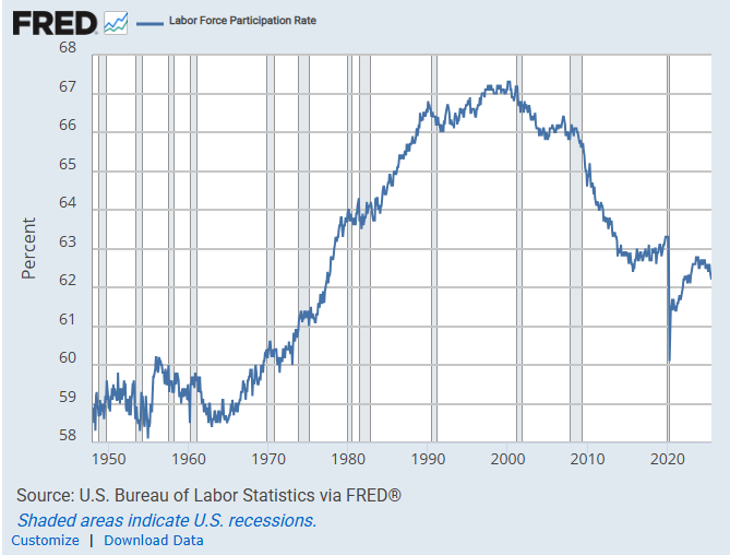
Additionally, when inflation appears contained and the unemployment rate remains relatively low, a restrictive rate policy hardly makes sense when there is always room for improvement in the nation’s employment picture. The labor participation rate as of July 2025 is just 62.2% of able-bodied adults, significantly less than the 67.3% figure in early 2000, showing that cutting rates may be beneficial to the US labor market. As of late 2025, the Trump Administration certainly agrees, arguing that the Federal Reserve should be cutting rates to improve the employment picture for American workers.
Many market watchers think that the next round of significant rate cuts by the Federal Reserve – and the long awaited large rate drop for mortgage rates, conventional and DSCR alike, will only come when the labor market “breaks” or when the unemployment rate significantly ticks up past the psychologically important 5% mark. This may be the key metric to monitor for real estate investors sitting on the sidelines and waiting to restart portfolio building once interest rates are cheap again.

Various reports about the health of the so-called “jobs market” are currently center stage in influencing Fed rate decisions, data released by government and private sources related to changes in jobs, jobless claims and the unemployment rate. In 2025, with inflation fears fading away and AI-induced jobs anxiety on the horizon, these data points are in the spotlight.

Another critical monthly release from the Bureau of Labor Statistics (BLS) is the Employment Situation Report, more commonly known as the “Jobs Report.” This report estimates the net change in nonfarm payroll employment for the prior month and provides the current unemployment rate. Together, these figures are among the most closely watched indicators of economic health and labor market strength. While the “unemployment rate,” or percentage of American adults classified as unemployed usually leads headlines and political talking points, it’s the net change in employment or “number of jobs added” (or lost in months of slipping employment) that is the primary data point that affects interest rates.
The Jobs Report is released at 8:30 a.m. Eastern, typically on the first Friday of each month, and usually “kick starts” the market moves for interest rates each month. The surprise factor, whether the report “beats” or “misses” forecasts, is what drives volatility. Like most other data points, the number of jobs added versus Wall Street expectations, rather than versus the prior month or year or even raw number itself, is what moves markets and rates, since this “resets” potential Federal Reserve rate decision making and how it might affect their current thinking and outlook. For example, it’s likely that a jobs report showing that 250,000 jobs were added versus an expectation of 300,000 jobs added would be viewed as worse than a jobs report where 125,000 jobs were added (versus an expectation of 250,000) even though twice as many jobs were added! This is because the market “prices in” everything ahead of time, specifically around what the “Fed will do” – it’s all about expectations when it comes to if a jobs report is “good” or “bad.” Funny financial system we’ve got in the US in this day and age isn’t it!
An important note is that the unemployment rate is not just a simple percentage of able-bodied Americans without jobs versus with jobs. There is lots of nuance and there are many economic assumptions that go into the data – which only counts those “actively looking for work” – i.e. the “labor force participation rate.” The unemployment rate number does not include people who “could” work but are actively choosing not to, such as students, early retirees, caregivers and housewives. It also does not include people “who would like to work but have given up looking for a job.” Considering both of these types of able-bodied workers are not included in the unemployment rate, it can be credibly argued that the number is fairly misleading. Additionally, the labor force participation rate also has been steadily falling for a couple of decades, which can make the unemployment rate itself a somewhat unreliable indicator, as people actually not working, what most people would call “unemployed” is rising vertically, but this is not reflected in the BLS unemployment rate data.
Labor Force Participation Rate Since 1950
Additional nuances of the unemployment numbers and reports are related to looking at native-born workers vs. foreign born workers, especially in light of potential crackdowns on illegal alien workers and scandal-ridden foreign jobs programs like H-1b that may finally get cleaned up under the second Trump Administration. These political hot button changes might skew the models that form the all-important Wall Street expectations.
Additionally, when digging deeper into the jobs data, the differences between full time jobs and part time jobs can paint a different picture from just the headline numbers. Keen market watchers can dig deep into the numbers reported first thing in the morning, with many market movements driven by automated algorithms that quickly move based on headlines, the movement of rates and yields may have reversals or up and down moves throughout the trading day as people (or algorithmic AI agents) dig into the numbers, remember, these reports come at 8:30 AM eastern time before trading opens and with an entire day for the data to be digested, so rate monitoring can sometimes be a full-day job!
By 2025 and likely for the significant future, the monthly jobs report is likely the most meaningful data point for monitoring mortgage rates, including DSCR Loan rates. Investors should focus on the jobs added (or “lost” if things really start to go sideways, or downhill) compared to expectations, while also monitoring the unemployment rate and other aspects of the data as well. The headline numbers and the spin from political commentators on both sides of the aisle will continue to be omnipresent; but the next big wave of real estate investing opportunity, and opportunity for generational wealth through rental properties, will likely come when the “jobs market breaks” and the Federal Reserve cuts interest rates back towards zero, with mortgage rates including DSCR Loan rates to likely follow back to historic lows.

While monthly releases like CPI and the Jobs Report usually dominate headlines, the weekly Jobless Claims release is another critical indicator that can move bond yields and mortgage rates. Published every Thursday at 8:30 a.m. Eastern, it provides a much more frequent pulse on labor market conditions than monthly surveys.
The Jobless Claims report tracks two figures: Initial Claims, which measure how many people filed for unemployment insurance for the first time in the prior week, and Continuing Claims, which show the number of people who have already filed an initial claim and who have experienced a week of unemployment and then filed a continued claim to claim benefits for that week of unemployment. A sudden rise in Initial Claims may signal an economic slowdown ahead, leading markets to price in a higher probability of Fed rate cuts and pushing Treasury yields lower. On the other hand, persistently low or falling claims reinforce a narrative of labor market resilience, supporting higher yields and mortgage rates. Taken together, these numbers act as an early warning system for labor market weakness or strength.
Because the data are weekly, Jobless Claims often serve as the “heartbeat” of the employment market. While not as impactful as the monthly Jobs Report, this data point is typically the primary mover of Treasury yields every Thursday. Essentially, if it’s a Thursday trading day, interest rates, including mortgage rates, are likely moving up or down based on this jobless claims data, even if the moves are more muted than bigger ticket, less frequent releases like the monthly jobs report.
Another closely related dataset is the Job Openings and Labor Turnover Survey (JOLTS), released monthly by the BLS. JOLTS measures the number of job openings, hires, and quits across the economy. In recent years, especially post-pandemic, JOLTS has become a key market focus because a high level of openings suggests a tight labor market, while a decline in openings signals cooling demand for workers. Market watchers often view JOLTS as a broader, structural complement to the more immediate Jobless Claims figures.
As with CPI and the Jobs Report, what really matters isn’t just the headline numbers but how they compare with expectations. If claims or JOLTS figures come in much worse than forecast, rates typically fall as markets anticipate easier Fed policy. If they come in stronger than expected, yields usually rise on the prospect of tighter monetary conditions. For investors, these labor-market reports provide a valuable real-time check on economic momentum between the larger monthly data releases.

In addition to the official government employment data, markets sometimes look to the ADP National Employment Report, often called the ADP Jobs Report. Unlike CPI or the BLS Jobs Report, this one comes from a private source, the payroll processing giant Automatic Data Processing (ADP), which uses anonymized payroll data from millions of workers in partnership with the Stanford Digital Economy Lab.
The report is released at 8:15 a.m. Eastern on the first Wednesday of each month, typically two days before the official BLS Jobs Report. That timing has made it something of a “preview” of the government data, though it’s important to note that ADP numbers don’t always line up with BLS results and can sometimes diverge significantly.
Historically, the ADP Jobs Report hasn’t carried as much weight for markets as CPI or the official Jobs Report. It usually doesn’t move Treasury yields or mortgage rates on its own, partly because there isn’t the same set of Wall Street consensus expectations to measure surprises against. For that reason, its market impact tends to be muted compared to the official government releases.
That said, as the Federal Reserve’s focus in 2024 and 2025 has shifted more heavily toward labor market conditions alongside inflation, the ADP report has attracted growing attention. Investors increasingly treat it as an early signal of how strong or weak the upcoming BLS Jobs Report might be. Additionally, when the October 2025 “government shutdown” occurred when Democrat congressional members filibustered the government spending bill, no monthly jobs report was released on October 3, 2025 when it was supposed to be due (for September 2025 data). The ADP, coming from a private source, had been released earlier in the week, and in a climate of political gridlock where BLS-derived data doesn’t come out, ADP could evolve from a secondary data point into a more meaningful driver of rate sentiment.

In addition to reports and data releases specifically about inflation or employment (the Federal Reserve’s two responsibilities under their mandate), some additional economic reports that show data about the US economy in general have also proven influential to bond yields and thus mortgage rates and DSCR loan rates as they can influence the Fed’s rate thinking. This is because while these reports aren’t directly about jobs or inflation, they show information on the economy or economic sectors in general, and measurements of economic growth or contraction are typically closely tied to employment and inflation outlook. As such, here are a few of the important “economic reports” that influence the Fed’s rate thinking and thus mortgage rates, and should be understood and monitored by the most well-prepared real estate investors.

The ISM U.S. Manufacturing PMI is one of the most closely watched leading indicators of economic health. Published by the Institute for Supply Management (ISM), the report surveys purchasing managers across the manufacturing sector and aggregates their responses into a single index. The survey covers five equally weighted components, new orders, production, employment, supplier deliveries, and inventories, which together provide an early snapshot of where the economy may be headed.
The index is scored on a 0–100 scale, with 50 representing neutral (no change in activity). Readings above 50 signal expansion in manufacturing activity, while readings below 50 indicate contraction. Because manufacturing is highly sensitive to demand cycles, supply chains, and interest rate shifts, this PMI is regarded as a reliable early warning system especially since it’s released on the first business day of each month at 10:00 a.m. Eastern, making it one of the earliest major economic releases to provide a read on the prior month.
For investors, a weaker-than-expected Manufacturing PMI reading often reinforces concerns about slowing growth and can push bond yields, and mortgage rates, lower. Conversely, stronger-than-expected results tend to support higher yields by signaling economic resilience. While the survey focuses on manufacturing, its timeliness and sensitivity make it one of the most important “first look” indicators for market watchers and rate forecasters alike.

Alongside its manufacturing survey, the Institute for Supply Management (ISM) also publishes the Services PMI, which tracks conditions in the far larger U.S. services economy. Since services make up roughly 70–80% of U.S. GDP, this index is often considered more representative of overall economic momentum than its manufacturing counterpart.
Like the manufacturing survey, the Services PMI compiles responses from purchasing and supply executives, covering categories such as business activity, new orders, employment, and supplier deliveries. The data are combined into an index scored from 0 to 100, with 50 marking neutral. Readings above 50 indicate expansion in services activity, while readings below 50 indicate contraction.
The ISM Services PMI is released on the third business day of each month at 10:00 a.m. Eastern, a few days after the Manufacturing PMI. Markets watch this report closely because it provides an early and timely read on demand trends in areas like health care, finance, retail, hospitality, and professional services - sectors that directly shape consumer confidence, employment, and broader growth.
For bond markets and mortgage rates, the Services PMI carries weight because it reflects the backbone of the U.S. economy (services make up over 70% of the US economy). A weak reading relative to expectations can spark concerns of slowing growth and push Treasury yields lower, while stronger-than-expected data tends to reinforce confidence and drive yields higher. For real estate investors, this report matters not just for rates but also as a gauge of the labor market and consumer-driven sectors that underpin rental demand for their properties.

Beyond the national ISM surveys, several regional PMI reports provide a closer look at local economic conditions. While narrower in scope, these indexes often serve as leading indicators for national trends and can generate short-term volatility in bond markets when they diverge sharply from expectations.
The most widely followed regional PMI is the Chicago PMI, also known as the Chicago Business Barometer. Published by the ISM–Chicago each month on the last business day, it measures conditions in Midwest manufacturing, which has historically been a bellwether for U.S. industrial activity. Like other PMIs, it is scored on a 0–100 scale, with readings above 50 signaling expansion and below 50 contraction. Markets sometimes view Chicago PMI as a preview of the ISM Manufacturing PMI released a few days later.
Two other regional surveys also stand out:
While none of these regional indexes carries the weight of national ISM reports, they are still closely monitored. Weak regional PMI readings can reinforce expectations of slowing growth and push yields lower, while strong surprises can add upward pressure. For real estate investors, these reports are best viewed as early signals, useful for anticipating shifts in mortgage rate trends before the bigger national data hits.

The most comprehensive measure of U.S. economic output is Gross Domestic Product (GDP), which tracks the total value of goods and services produced in the economy. GDP is reported quarterly by the Bureau of Economic Analysis (BEA) and is released in three stages: the Advance estimate, the Second estimate, and the Final estimate, each incorporating more complete data.
Markets typically react most strongly to the Advance release, published about four weeks after quarter-end. A stronger-than-expected GDP print reinforces the idea of a resilient economy, which often leads to higher Treasury yields and mortgage rates. Conversely, a weak or negative GDP reading can spark concerns of slowdown or recession, pushing yields lower. While GDP is less “immediate” than monthly reports like CPI or the Jobs Report, it is still one of the most important big-picture indicators of long-term economic strength.

In between quarterly GDP releases, markets look for more real-time estimates. One widely watched tool is the Atlanta Fed’s GDPNow model, which uses incoming economic data (like retail sales, industrial production, and PMI surveys) to produce a running forecast of current-quarter GDP growth.
GDPNow updates are published several times a month on the Federal Reserve Bank of Atlanta’s website, often immediately after major data releases. While the model is not an official forecast, it provides a transparent and frequently updated gauge of how the economy is tracking before the BEA’s quarterly release.
Investors and traders increasingly watch GDPNow as an “early read” on growth momentum. When the model’s estimate swings sharply higher or lower, it can move expectations for Treasury yields, and by extension, mortgage and DSCR Loan rates, even before the official GDP report is released.

One critical aspect of all of these reports is understanding what makes up these data, i.e. just how reliable and real these reports are. Many people are very surprised to learn how much of these crucial reports – reports which drive the Federal Reserve rate decisions which have come to dominate every aspect of the US (and even global) economy – from Wall Street to “Main Street” and of course, mortgage rates, are based on estimates rather than actual data.
Most of these reports are based on surveys done to either “households” or “establishment” (i.e. business) respondents to create representative samples and information extrapolated to the country at large. However, when looking at the survey “response rates” or what percentage of respondents actually respond, it’s often much less than people would assume. Notably, the responsiveness rates for many of the reports have been on a persistent and steady decline over time, particularly in the last decade preceding 2025.
For example, take a look at the chart of response rates for the enormously important reports that drive Fed decision making regarding their key full employment mandate: the “Current Employment Statistics Survey (CES)” used in the jobs report (CES) and the Job Openings and Labor Turnover Survey (JOLTS) that provides additional employment data.
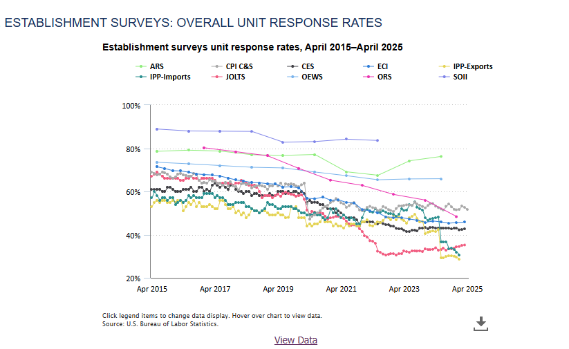
The CES, as of the March 2025 Data has a response rate of just 42.6%! This means, for the crucial jobs report, the survey which makes up the data is ignored by over half of the respondents! The JOLTS data, while improving from the stunningly low response rates of late 2022 when it almost dipped below 30%, clocks in at just a 35.2% rate. So what makes up the difference? Estimates, which are really at the end of the day, just “guesses” from government officials, as well as all sorts of “seasonal adjustments” that further alters the economic data.
While the data are supposed to be methodically collected, analyzed and reported by a neutral government bureau, as of 2025, human beings still work there and manage the results (at least before fully neutral AI-robots take over, if ever) and work with deeply incomplete data sets, including, again for emphasis, responses from less than half of the survey receivers. Even if you believe that the government officials, who have their own political preferences and also whose own jobs could be dependent on the data going one way or another, would never skew the data in favor of their biases, the long history of humanity and human nature indicates otherwise, even if not intentional!
Regardless, whether due to the lack of a robust response rate, human bias or manipulation or whatever of many other factors that could play a role, the data used in these influential reports are always preliminary and an estimate relying on a heavy dose of assumptions and modeling. These reports often get revisions, and unsurprisingly, significant revisions in the months after release can paint a picture of the data at odds with or significantly different than the first release. In recent years, traders and market watchers have begun to catch on to the importance of not just the “headline” numbers for the current month, but any significant revisions from prior data as well. Even so, the reality is that the revised numbers are reacted to less fervently than might be assumed as the Fed rate decision makers typically decide on rate decisions “meeting by meeting” so revisions of older data don’t have as large of an effect. Nevertheless, sophisticated market watchers looking to track rates and predict market changes should keep an eye on trends in revisions and dig deeper into the numbers to get a full picture.
In addition to revisions on previous monthly reports, usually dropped in to the next monthly release, the Bureau of Labor Statistics recently made significant headlines and a political fuss with a significant “annual revision,” a fall tradition that does a more comprehensive lookback on job report estimates and does a full annual rework, for 12 months instead of one at a time. In August 2024, a couple months before the critical 2024 Presidential Election, the BLS reported that a whopping 818,000 fewer jobs were created than previously reported for the period between March of 2023 and March 2024, a significant and massive change. This led the Federal Reserve, a few weeks later, to cut rates by double the normal amount (50 basis points), their first rate cut in four years! Many speculated that rates would have been cut in the months prior, or even in 2023, had the jobs data showed less robust additions, and many further speculated political bias was behind these revisions and the subsequent double rate cut, as a thinly veiled (but ultimately doomed) attempt to move the election needle towards Kamala Harris with an intended economic boost.
Overall, in a charged political climate with unprecedented scrutiny and management of the government bureaucracy, including BLS and the Federal Reserve, which tend to skew heavily left and under threat from a cost-cutting Trump Administration, real estate investors monitoring the market situation should pay extra close attention to response rates, revised reports and large one-off announcements of past data changes.
© 2026 Harpoon Capital, LLC. All Rights Reserved. WARNING: Unauthorized distribution, copying, or sharing of this guide is a violation of U.S. Federal Law and is punishable by civil penalties of up to $150,000 per violation. We aggressively enforce our intellectual property rights.